5 Tips: What Designers Know About Designing Mailers

Too often considerable resources are spent on the marketing literature, and yet the decision as to how it will be presented to your target market is made by the mailroom.    It is the mailer, and not the literature inside, that is on the front line speaking volumes about the quality of your firm.  Here are five great design tips that will enable your mailer to work as hard as your marketing materials:

1.  Paperboard mailers are exceptionally print friendly (unlike bubble mailers, boxes, and Tyvek envelopes).  So get bold about using that space to your company’s advantage.  Put your logo, your branding statement or icon, and even “Follow us on Twitter!”.   A generic approach is best if you anticipate that the mailer will have multiple uses.

2.  Alternatively, design your mailer specifically to create excitement about what’s inside.  For example:  “Your samples are here!” or “Valuable conference materials for Expo 2011!” .  This ensures your package gets opened first, rather than the recipient discovering it on their own only once they’ve opened it.

3.  Put business on the back, branding on the front.  In other words, put your mailing label on the back side of the mailer where the flap closes so that you have a full canvas on the front side to let your branding and marketing message shine.

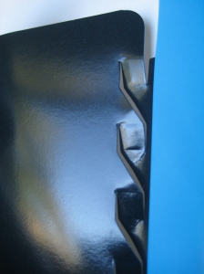
4.   Putting your mailer in the mail will put your beautifully printed mailer through its paces, so avoid printing it in a dark color end to end (a.k.a. “full bleed).  If the mailer’s corners get bruised in any way, the white fibers in the paperboard will appear and distract the eye from the overall look of the package.

5.  QR Codes are all the range on billboards these days, so why not think of your mailer as a giant billboard for your company that just happens to be delivered to your client’s mailbox? Add a QR code to your mailer to tie your offline marketing efforts to your online ones.  You could feature a video of your CEO thanking your customer for their business!

Sari McConnell at smcconnell@conformerinc.com

Recyclable Tyvek® Mailers? Not Really.

Is it legitimate to say that a product is 100% recyclable when, in reality, the majority of municipalities won’t accept that product for collection?

This contradiction has always left me scratching my head.  Why? Technically DuPont™ Tyvek® high density polyethylene (HDPE) material can be safely incinerated BUT only if the product gets sorted and collected.  Tyvek has a collection problem and they know it: they’ve put well-intended but impractical programs in place to address the issue.

I did a little detective work, and here’s what I learned:

1.  Most municipalities won’t collect Tyvek envelopes.  Waste Management, with over 25% market share in the solid waste services industry, states: “there’s no single answer to what is acceptable for recycling, since municipal programs vary.”  So digging deeper at the municipality level, I found that many municipalities collect HDPE but only if they are in the form of containers:

#2 HDPE : Examples: Milk jugs. Juice bottles. Bottles for bleach, laundry detergent, some household cleansers.  Motor oil bottles.  Butter, oleomargarine, and yogurt tubs.

2.  In response, DuPont has created a recycling program in partnership with Waste Management but get this — it requires you to pay them $15 to get the kit!  Then the burden is on you to mail your recyclable Tyvek to them.  If you are a household or a small to medium business – or if you are a large corporation sending packages to these kinds of recipients – how likely do you think Tyvek recipients are going to buy a kit, separate out all the Tyvek, and mail it back?  Not very likely.

So think hard before you use Tyvek – because you are putting a product into circulation that most likely will not be recycled.  There are other protective mailers out there that do the job and are authentically 100% recyclable through your local municipality.

Sari McConnell at smcconnell@conformerinc.com

Conformer Hall of Shame #13: Bubble Mailer Failure (Great Video!)

Microsoft ran a viral campaign years ago which recently resurfaced on YouTube.  Its intention, I think, was to persuade the public to abandon paper altogether.  Alas, paper usage has outlasted their campaign.

This hilarious video did succeed in brilliantly illustrating how awkward the bubble mailer can be, and questions why we put up with it. I mean, it’s not even recyclable. The truth is, we still live in a paper-bound environment. That means making better choices: using products that work better, look better, and are more environmentally friendly. (Sorry bubble mailer, you fail on all three.)

Many thanks to one of our favorite Conformer fans who brought this great video to our attention this morning:  “I saw this (video) and thought of you and your blog. If they had been using Conformer mailers, this wouldn’t have been a problem,”  said Nicole R. Benner | Client Events Manager | Blank Rome LLP.

-Sari McConnell at smcconnell@conformerinc.com

BREAKING NEWS: ‘Blackhole’ Virus Attacks End Users on USPS’s Intelligent Mail Services Website

Conformer Products has just been alerted this morning that the United States Postal Serviced website has become a victim of one of the more robust viruses called “Blackhole” that is well designed to evade antivirus detection and get onto as many end user machines as possible.

Specifically, the “Rapid Information Bulletin System” (RIBBS) pages on the U.S. Postal Service’s website have been infected where anyone visiting these pages would be infected.  Normally, these pages are designed to provide end users visiting the site with intelligent mail services like tracking and logistics information.   This obviously applies to users of Conformer mailers and envelopes using the U.S. Postal Service.

According to Dark Reading, a trusted security industry blog, the infected site was identified by Michael Sutton, vice president of research at Zscaler, who alerted the USPS now addressing the issue.

If you would like to learn more about the technical details of this virus, we encourage you to read more on Zscaler’s blog.

-Sari McConnell at smcconnell@conformerinc.com

5 Tips: Presentation Folder Structural Disasters to Avoid

I heard more than one actress on the Oscar Red Carpet give credit to Spanx as the key to her great look.  Great construction marries both form and function, and a great start is knowing which presentation folder designs fall flat.  Here are my Top 5:

1. The Box Pocket

Why Avoid: A mini box built into a capacity folder is great in theory, but it takes a terrible beating in reality.  Unlike a sturdier shoebox, the box pocket folder collapses under its own weight (even if you use 18pt paper stock).  Once these folders get stacked, filed away or – God forbid mailed – they begin to fail almost immediately.  They’re bulky to ship and store, so you’ll pay extra for this bad choice.

2. The Zippered Pocket

Why Avoid:  These delicate cuts may give you extra room in the pocket, but giving these cuts a little tug (i.e., use it) rips the pocket wide open.

3. Reinforced Edges with T-shaped cuts

Why Avoid: The pockets need to be the strongest part of the folder to hold the weight of your materials.  So why you’d cut into the pocket and create a weak spot precisely where it needs solid construction is beyond me.

4. The Presentation Folder Wrap

Why Avoid: This presentation folder wraps the contents with flaps instead of pockets.  You often see this no-no in tri-fold pocket folder design.  This folder is guaranteed to deposit its contents in your lap when you open it, as its lack of construction is expressly designed to do so.

5. The Plastic Laminator

Why Avoid: All that good stuff about “going green,” eco-friendly and FCS-certified gets tossed out the window when you coat a paperboard folder in plastic lamination.  Fusing paper and plastic together makes your folder 100% NOT recyclable, just like a diaper in a landfill.

Sometimes making a great choice is knowing what not to choose.

Sari McConnell at smcconnell@conformerinc.com

5 Tips: What Designers Know about Great Presentation Folders

Award-winning folder featuring pearlized linen, blind embossment, and 2-color spot

How do you design a standout presentation folder?  Designers have several tricks of the trade – what I call “special effects” – that you can use to create something really special for your company. Even better, an extraordinary folder doesn’t need to cost you any more than an ordinary one.

These tips will help you attain presentation folder greatness.

  1. Treat the interior space of the folder as valuable real estate.  Your documents may cover up this space before your client removes them from the folder… then voilà!  Feature your client list, testimonials or marketing copy.*
  2. Finish the folder… aqueous finish that is.  Aqueous finish seals in the color printed on blank stock.  Many pocket folders are finished with glossy finish by default, but you have options.  The color can be sealed with an aqueous finish – gloss, satin, or matte – just like house paint.  Or you can go for UV Gloss with a super shiny finish.  Conversely, if you’ve chosen a dark folder color, consider a satin finish to reduce signs of fingerprinting.  Just be sure the finish fits the personality of your business.  Travel industry?  Gloss.  Insurance?  Matte.
  3. Add sparkle to your folder design with UV spot.  Folder designers are very familiar with using embossment or foil stamping to make a logo pop.  But consider UV spot for a more modern look.  It can add high gloss shine in a precise place, like right on top of your logo.  And finish the folder underneath in matte aqueous for the strongest contrast.
  4. Create texture using linen stocks or embossment to add interest and perceived value, particularly if you have a conservative color palette.  Or dress up your look with a pearlized linen (which is FSC-certified, too).
  5. If your corporate colors are dark (see Brand Building Great Presentation Folder Design story) and you want a guaranteed crack-free finish, check out Xtreme Coated Cover paper stock.  It’s the only paper I know of with a crack-free guarantee.

* If you use a tint of your PMS color plus the PMS color itself, you can create nice contrast while still running a one-color job…which can save you money.

This article is part of a series on great presentation folder design featured on the Conformer Products’ Blog.

Sari McConnell at smcconnell@conformerinc.com

5 Tips: How to Pick Paper Stock for Presentation Folders

Selecting paper stock is one of the toughest – yet most critical – decisions when ordering presentation folders.  Paper choice affects the perceived value of your firm. It determines how the ink gets absorbed and the final effect produced on your folder.

These tips will make sure you select the right stuff before you’re stuck with the wrong thing all year long.

  1. Choose the right paper weight.  I recommend 14 point; a 12 point paper stock weight risks feeling too flimsy, and 18 point paper is overkill.
  2. Invest your budgeted dollars in quality paper stock.  To get the best bang for your buck, choose one of the papers that your printer buys in bulk.  If you’re set on something specific, choose a pocket folder provider that already carries it as a stock paper.  If you’re placing a sizable order, your paper can be easily and reasonably sourced.
  3. Know the difference between C1S and C2S, especially if you’re considering print on both sides of your presentation folder.  C1S is “Coated One Side” and C2S is “Coated Two Sides,” with the former costing less than the latter.  Uncoated paper absorbs ink differently than coated paper, and it has a matte appearance.  If you want your folder to have a consistent finish throughout,  go with C2S paper.
  4. Pick an FSC- or SFI-certified paper.  FSC is Forest Stewardship Council, and SFI is Sustainable Forestry Initiative.  Both organizations ensure that your paper stock comes from sustainably harvested forests.
  5. Honor the investment you’ve made in your company.  Your print ads, and your social media campaign.  Don’t stick your logo on a cheap folder, or you will cheapen the very thing your customer puts his hands on…with your name on it.

This article is part of a series on great presentation folder design featured on the Conformer Products’ Blog.

Sari McConnell at smcconnell@conformerinc.com

5 Tips: Make Your Logo Shine on Your Presentation Folder

Great Logo Treatment on a Presentation Folder

Many firms will tell you that they don’t have a brand, but they do have a reputation.  Whether it’s law, financial services, accounting, insurance or consulting, a firm’s reputation is everything.  And that reputation materializes in the company logo.

These tips will help your unsung hero – your presentation folder – reinforce your reputation using only your logo.

  1. Invest in a quality paper stock.  If your law firm wants to convey the story of success, you need to show it, not tell it.  Your pocket folder – and your business card, for that matter – needs to feel expensive to the touch.  You’ll be saving money on print, so you’ll have the coin to put it in the paper.
  2. Consider embossing your company logo.  Embossment raises the surface of the folder to give it dimension.  This elevates your logo, giving it more heft on the page.  Blind embossment is a natural choice for your presentation folder when you’ve chosen a textured stock like linen  that may not be printed at all.   Printed embossment is more often seen on coated stocks (like C1S or C2S) where your logo is raised and printed on the paper.
  3. Consider foil stamping, but proceed carefully.  Foil stamping adds a gold or silver (and other color options) metallic to your logo .  It is a very classy effect provided that it is used sparingly.  If your logo is an elegant script or a thin font, foil stamping is a great option.  But if your logo features fat lettering, foil stamping may give you too much flash to your look (especially if you’re a CPA or an attorney).
  4. If you are unsure of how to size your logo on the cover, err on the side of too big.  A too-small logo on your presentation folder will make your firm look even smaller.
  5. If you don’t already have a logo, select an official font to represent your firm and stick with it. Many graphic designers specialize in font treatments, and it’s not an expensive investment. Using the same font on your presentation folders, your letterhead and your website will create a unifying look that shows (not tells) your clients that you’ve got your act together.

This article is part of a series on great presentation folder design featured on the Conformer Products’ Blog.

Sari McConnell at smcconnell@conformerinc.com

5 Tips: Could Your Presentation Folder Work Harder to Build Your Brand? (You Betcha.)

Brand building means consistently delivering your brand message to your target market whenever your consumer encounters your brand.  Your presentation folder is a key touchpoint between your brand and your consumer:  displaying your proposal, delivering your product samples, or introducing your services for the first time.

These tips will convert your workhorse marketing tool – your presentation folder – into a great brand statement.

  1. Use your corporate colors boldly. If you don’t have a corporate color palette, enlist a graphic designer to select one or two colors from the Pantone Matching System (PMS). The Pantone guide is the definitive international reference for selecting, matching and controlling ink colors. Using PMS colors will enable you to specify “your colors” by number for every print job.
  2. Flood coat your paper stock with one PMS color and then use your second PMS color as an accent.  Perhaps flood coat the interior (Side 2) of your folder so the pockets are the first PMS color, and the back panels are in the second PMS color.
  3. Don’t stop at your company logo.  A folder gives you lots of opportunity to integrate the company tag line or a corporate visual image that represents your brand.
  4. Bridge your offline and online marketing efforts.  If you are using in YouTube, Facebook, Twitter and the like, feature these icons on the folder holding your marketing literature.
  5. A busy design can kill a folder’s versatility, so tread lightly.  Think of the folder as gift wrap.  You want it to say “open me,” but don’t let the packaging overwhelm the gift inside.  You want the literature inside to do most of the talking.

This article is first in a series on great presentation folder design featured on the Conformer Products’ Blog.

Sari McConnell at smcconnell@conformerinc.com

Try Googling “USPS Damaged My Package”

USPS Damaged My Package

Yesterday the USPS delivered a package from Amazon in a corrugated box that looked like it been tossed into a cage of chimpanzees just before feeding hour.  Normally, you think of corrugated boxes as being on the indestructible side of the packaging family.  And because of this — despite much higher postage costs — we often gravitate to this kind of packaging for added protection.

Chimpanzees 1, Hardcover Book, 0.

I don’t know what mail carriers (and I’m including UPS and FEDEX here) are doing with our parcels during transit beyond overcharging us for handling, but I’ve received some packages in some truly dreadful condition lately.  And if you feel like getting your hair blown back, try googling “USPS Damaged My Package”.  I am not alone.  I feel bad for the eBay sellers and the Amazon resellers whose livelihoods depend largely on the mail service.

Given these facts, the condition of the package itself is not as critical as whether or not that package protected the contents.  And here, Amazon is to blame, not the USPS.  There was way too much excess capacity and internal shift in the box containing my book order.  Because of the excess capacity in the box, the internal shift subjected the books to every bump and bruise incurred by the box itself.  These photos show you exactly what happened to the books along the way.

Is it a book or a paper airplane?

So how do you ensure your package survives the postal journey?

  • Do not be lured into an oversized package that boasts protection.
  • Whatever packaging option you choose, the packaging solution must conform to its contents to minimize the shift.
  • Use packaging that is sized correctly to the contents, and if it’s not, use eco-friendly fill to make up the difference.

These guidelines can’t guarantee a safe journey among the chimpanzees, but they dramatically improve the odds.

Sari McConnell at smcconnell@conformerinc.com